Nope it's a mixture of both plus background image or colourDr. Medulla wrote: ↑31 Oct 2017, 1:58pmSo common colour is a more important unifier than common typography?Kory wrote: ↑31 Oct 2017, 1:45pmI can't think of another album which does it like this, but I don't know if I'd call it a faux pas. I might not have chosen that font, but they might have been trying to make a statement, meaning the the two separate elements are intentional ("germfree" is clean and orderly, "adolescents," both in life and typographically, is not). I'd also have chosen to have the two words in the same color to pull it together more, but I think the play for garishness may have been intentional too (although I think the original used different colors from this anyway).Dr. Medulla wrote: ↑31 Oct 2017, 1:29pmIs it generally a faux pas to use two different designs/fonts within the album title like that? Other than their close proximity, isn't it a signal that they are two separate elements?Kory wrote: ↑31 Oct 2017, 1:16pmYou're not wrong about the type, Doc—the issue here is that the band name and album title are given roughly the same prominence or "weight". The album title is actually even a little MORE important, which is weird for a debut album. It wouldn't be so bad with regular type, but because both are basically logos, it would have been nice to have some differentiation.
Covering Album Covers
-
Marky Dread

- Messiah of the Milk Bar
- Posts: 59051
- Joined: 17 Jun 2008, 11:26am
Re: Covering Album Covers
Forces have been looting
My humanity
Curfews have been curbing
The end of liberty
We're the flowers in the dustbin...
No fuchsias for you.
"Without the common people you're nothing"
Nos Sumus Una Familia
-
Flex

- Mechano-Man of the Future
- Posts: 35991
- Joined: 15 Jun 2008, 2:50pm
- Location: The Information Superhighway!
Re: Covering Album Covers
Here's an all-time great album cover imho. Any critiques?

Wiggle, wiggle, wiggle like a bowl of soup
Wiggle, wiggle, wiggle like a rolling hoop
Wiggle, wiggle, wiggle like a ton of lead
Wiggle - you can raise the dead
Pex Lives!
Wiggle, wiggle, wiggle like a rolling hoop
Wiggle, wiggle, wiggle like a ton of lead
Wiggle - you can raise the dead
Pex Lives!
-
Marky Dread
- Messiah of the Milk Bar
- Posts: 59051
- Joined: 17 Jun 2008, 11:26am
Re: Covering Album Covers
Nope it's simple effective and punk.
Forces have been looting
My humanity
Curfews have been curbing
The end of liberty
We're the flowers in the dustbin...
No fuchsias for you.
"Without the common people you're nothing"
Nos Sumus Una Familia
-
Marky Dread
- Messiah of the Milk Bar
- Posts: 59051
- Joined: 17 Jun 2008, 11:26am
Re: Covering Album Covers
The thing with punk it wasn't about setting barriers it was about defying rules etc. Its garish greens dayglo yellow lurid pink it's bold brash in your face it's fuck you art world.
Forces have been looting
My humanity
Curfews have been curbing
The end of liberty
We're the flowers in the dustbin...
No fuchsias for you.
"Without the common people you're nothing"
Nos Sumus Una Familia
-
Dr. Medulla

- Atheistic Epileptic
- Posts: 116721
- Joined: 15 Jun 2008, 2:00pm
- Location: Straight Banana, Idaho
Re: Covering Album Covers
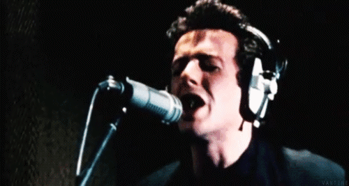
It certainly suggests something else entirely for punk. It's not aggressive or defiant. Muted green wash and hiding the face signals modesty if not defeat. That's not a cover that tells the consumer to be ready to kick some ass, but perhaps instead offering sympathy if not a downer. This ain't your older brother or sister's punk.
"Ain't no party like an S Club party!'" - Richard Nixon, Checkers Speech, abandoned early draft

Re: Covering Album Covers
Nope. None at all.
Got a Rake? Sure!
IMCT: Inane Middle-Class Twats - Dr. M
" *sigh* it's right when they throw the penis pump out the window." -Hoy
IMCT: Inane Middle-Class Twats - Dr. M
" *sigh* it's right when they throw the penis pump out the window." -Hoy
-
Marky Dread
- Messiah of the Milk Bar
- Posts: 59051
- Joined: 17 Jun 2008, 11:26am
Re: Covering Album Covers
Hence only a minor threat .Maybe his head is down in disbelief of the state of music.Dr. Medulla wrote: ↑31 Oct 2017, 2:27pmIt certainly suggests something else entirely for punk. It's not aggressive or defiant. Muted green wash and hiding the face signals modesty if not defeat. That's not a cover that tells the consumer to be ready to kick some ass, but perhaps instead offering sympathy if not a downer. This ain't your older brother or sister's punk.
Forces have been looting
My humanity
Curfews have been curbing
The end of liberty
We're the flowers in the dustbin...
No fuchsias for you.
"Without the common people you're nothing"
Nos Sumus Una Familia

Re: Covering Album Covers
It depends entirely on the application. These are all just tools in one's box for making design work, but I would say generally so. Design has a rich tradition of mixing fonts, and it's one of the hardest things to get right. But if the two lines were the same font, but still different colors, I would personally say that would be less effective that what they have now. But it all depends on context and intent. Different solutions in different environments, for sure.Dr. Medulla wrote: ↑31 Oct 2017, 1:58pmSo common colour is a more important unifier than common typography?Kory wrote: ↑31 Oct 2017, 1:45pmI can't think of another album which does it like this, but I don't know if I'd call it a faux pas. I might not have chosen that font, but they might have been trying to make a statement, meaning the the two separate elements are intentional ("germfree" is clean and orderly, "adolescents," both in life and typographically, is not). I'd also have chosen to have the two words in the same color to pull it together more, but I think the play for garishness may have been intentional too (although I think the original used different colors from this anyway).Dr. Medulla wrote: ↑31 Oct 2017, 1:29pmIs it generally a faux pas to use two different designs/fonts within the album title like that? Other than their close proximity, isn't it a signal that they are two separate elements?Kory wrote: ↑31 Oct 2017, 1:16pmYou're not wrong about the type, Doc—the issue here is that the band name and album title are given roughly the same prominence or "weight". The album title is actually even a little MORE important, which is weird for a debut album. It wouldn't be so bad with regular type, but because both are basically logos, it would have been nice to have some differentiation.
"Suck our Earth dick, Martians!" —Doc
-
Marky Dread
- Messiah of the Milk Bar
- Posts: 59051
- Joined: 17 Jun 2008, 11:26am
Re: Covering Album Covers
It's not just about different type fonts and different color. Correct distancing/spacing are equally vital. Also knowng when not to include something.Kory wrote: ↑31 Oct 2017, 2:34pmIt depends entirely on the application. These are all just tools in one's box for making design work, but I would say generally so. Design has a rich tradition of mixing fonts, and it's one of the hardest things to get right. But if the two lines were the same font, but still different colors, I would personally say that would be less effective that what they have now. But it all depends on context and intent. Different solutions in different environments, for sure.Dr. Medulla wrote: ↑31 Oct 2017, 1:58pmSo common colour is a more important unifier than common typography?Kory wrote: ↑31 Oct 2017, 1:45pmI can't think of another album which does it like this, but I don't know if I'd call it a faux pas. I might not have chosen that font, but they might have been trying to make a statement, meaning the the two separate elements are intentional ("germfree" is clean and orderly, "adolescents," both in life and typographically, is not). I'd also have chosen to have the two words in the same color to pull it together more, but I think the play for garishness may have been intentional too (although I think the original used different colors from this anyway).Dr. Medulla wrote: ↑31 Oct 2017, 1:29pmIs it generally a faux pas to use two different designs/fonts within the album title like that? Other than their close proximity, isn't it a signal that they are two separate elements?Kory wrote: ↑31 Oct 2017, 1:16pmYou're not wrong about the type, Doc—the issue here is that the band name and album title are given roughly the same prominence or "weight". The album title is actually even a little MORE important, which is weird for a debut album. It wouldn't be so bad with regular type, but because both are basically logos, it would have been nice to have some differentiation.
Last edited by Marky Dread on 31 Oct 2017, 2:54pm, edited 1 time in total.
Forces have been looting
My humanity
Curfews have been curbing
The end of liberty
We're the flowers in the dustbin...
No fuchsias for you.
"Without the common people you're nothing"
Nos Sumus Una Familia
-
Dr. Medulla
- Atheistic Epileptic
- Posts: 116721
- Joined: 15 Jun 2008, 2:00pm
- Location: Straight Banana, Idaho
Re: Covering Album Covers
Sure sure, art and dogma shouldn't mingle. But that is quite enlightening to me because my instinct would be to think that consistent font type trumps all else. Then again, it's enlightening because that kind of work is so beyond my ken. I can bullshit interpret as well as the next phony, but designing something is just utterly foreign.Kory wrote: ↑31 Oct 2017, 2:34pmIt depends entirely on the application. These are all just tools in one's box for making design work, but I would say generally so. Design has a rich tradition of mixing fonts, and it's one of the hardest things to get right. But if the two lines were the same font, but still different colors, I would personally say that would be less effective that what they have now. But it all depends on context and intent. Different solutions in different environments, for sure.Dr. Medulla wrote: ↑31 Oct 2017, 1:58pmSo common colour is a more important unifier than common typography?Kory wrote: ↑31 Oct 2017, 1:45pmI can't think of another album which does it like this, but I don't know if I'd call it a faux pas. I might not have chosen that font, but they might have been trying to make a statement, meaning the the two separate elements are intentional ("germfree" is clean and orderly, "adolescents," both in life and typographically, is not). I'd also have chosen to have the two words in the same color to pull it together more, but I think the play for garishness may have been intentional too (although I think the original used different colors from this anyway).Dr. Medulla wrote: ↑31 Oct 2017, 1:29pmIs it generally a faux pas to use two different designs/fonts within the album title like that? Other than their close proximity, isn't it a signal that they are two separate elements?Kory wrote: ↑31 Oct 2017, 1:16pmYou're not wrong about the type, Doc—the issue here is that the band name and album title are given roughly the same prominence or "weight". The album title is actually even a little MORE important, which is weird for a debut album. It wouldn't be so bad with regular type, but because both are basically logos, it would have been nice to have some differentiation.
"Ain't no party like an S Club party!'" - Richard Nixon, Checkers Speech, abandoned early draft
-
Marky Dread
- Messiah of the Milk Bar
- Posts: 59051
- Joined: 17 Jun 2008, 11:26am
Re: Covering Album Covers
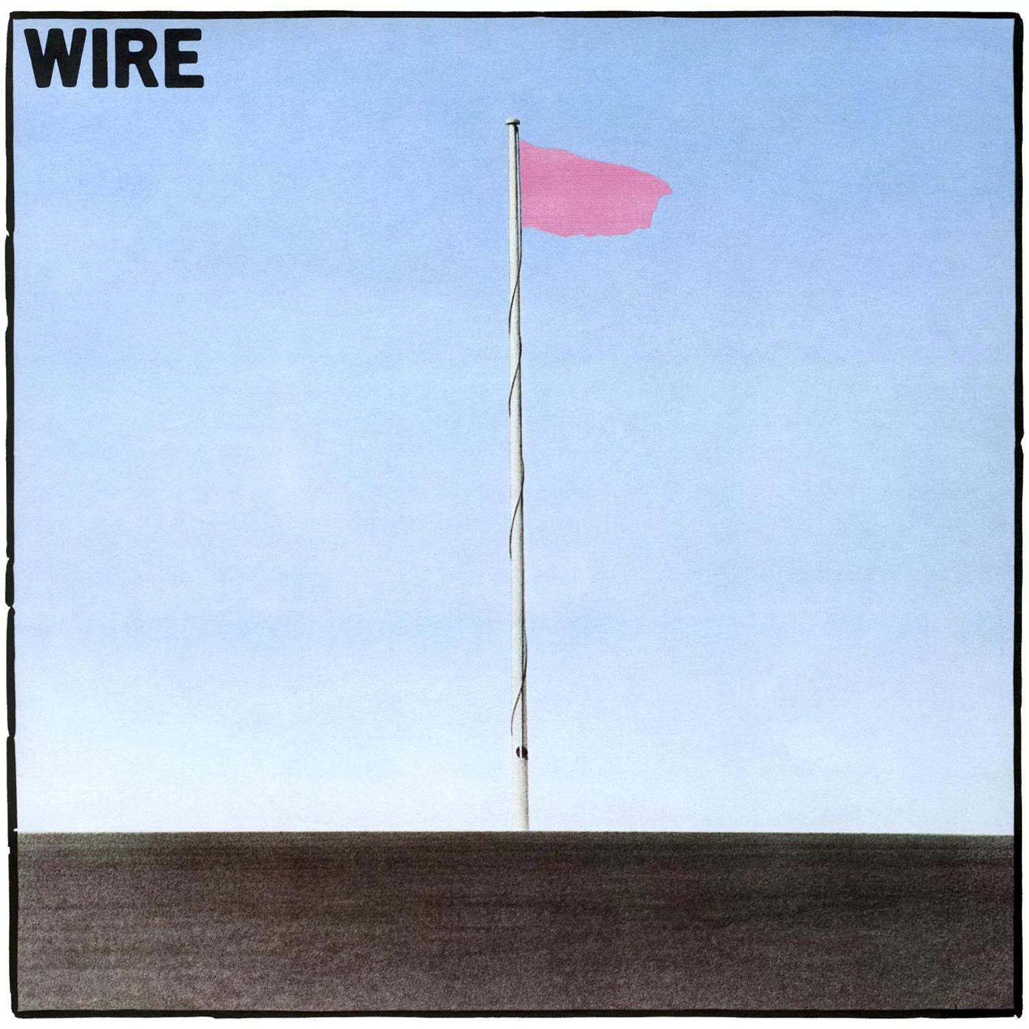
So easy grab a flag a pink one preferably and run to the top of the hill and place the flag up a flag pole. Then run back down the hill and take a picture.Dr. Medulla wrote: ↑31 Oct 2017, 2:52pmSure sure, art and dogma shouldn't mingle. But that is quite enlightening to me because my instinct would be to think that consistent font type trumps all else. Then again, it's enlightening because that kind of work is so beyond my ken. I can bullshit interpret as well as the next phony, but designing something is just utterly foreign.Kory wrote: ↑31 Oct 2017, 2:34pmIt depends entirely on the application. These are all just tools in one's box for making design work, but I would say generally so. Design has a rich tradition of mixing fonts, and it's one of the hardest things to get right. But if the two lines were the same font, but still different colors, I would personally say that would be less effective that what they have now. But it all depends on context and intent. Different solutions in different environments, for sure.Dr. Medulla wrote: ↑31 Oct 2017, 1:58pmSo common colour is a more important unifier than common typography?Kory wrote: ↑31 Oct 2017, 1:45pmI can't think of another album which does it like this, but I don't know if I'd call it a faux pas. I might not have chosen that font, but they might have been trying to make a statement, meaning the the two separate elements are intentional ("germfree" is clean and orderly, "adolescents," both in life and typographically, is not). I'd also have chosen to have the two words in the same color to pull it together more, but I think the play for garishness may have been intentional too (although I think the original used different colors from this anyway).Dr. Medulla wrote: ↑31 Oct 2017, 1:29pm
Is it generally a faux pas to use two different designs/fonts within the album title like that? Other than their close proximity, isn't it a signal that they are two separate elements?
Forces have been looting
My humanity
Curfews have been curbing
The end of liberty
We're the flowers in the dustbin...
No fuchsias for you.
"Without the common people you're nothing"
Nos Sumus Una Familia
-
Dr. Medulla
- Atheistic Epileptic
- Posts: 116721
- Joined: 15 Jun 2008, 2:00pm
- Location: Straight Banana, Idaho
Re: Covering Album Covers
The point is, that's just not how my mind works. That's why I've been quizzing Kory on this stuff, as someone trained in design. I'll never be able to do it myself, but I would like to understand a bit better the rationale behind choices.Marky Dread wrote: ↑31 Oct 2017, 3:00pmSo easy grab a flag a pink one preferably and run to the top of the hill and place the flag up a flag pole. Then run back down the hill and take a picture.
"Ain't no party like an S Club party!'" - Richard Nixon, Checkers Speech, abandoned early draft
-
Marky Dread
- Messiah of the Milk Bar
- Posts: 59051
- Joined: 17 Jun 2008, 11:26am
Re: Covering Album Covers
The thing is you would. Many tools to make it easy these days. It's the idea that matters just as much as the execution. If we are still talking about cover art. Business world is a different beast.Dr. Medulla wrote: ↑31 Oct 2017, 3:05pmThe point is, that's just not how my mind works. That's why I've been quizzing Kory on this stuff, as someone trained in design. I'll never be able to do it myself, but I would like to understand a bit better the rationale behind choices.Marky Dread wrote: ↑31 Oct 2017, 3:00pmSo easy grab a flag a pink one preferably and run to the top of the hill and place the flag up a flag pole. Then run back down the hill and take a picture.
Forces have been looting
My humanity
Curfews have been curbing
The end of liberty
We're the flowers in the dustbin...
No fuchsias for you.
"Without the common people you're nothing"
Nos Sumus Una Familia
-
Dr. Medulla
- Atheistic Epileptic
- Posts: 116721
- Joined: 15 Jun 2008, 2:00pm
- Location: Straight Banana, Idaho
Re: Covering Album Covers
It's not a question of tools—I've acquired all kinds of software—but I don't have that eye and instinct. I mean, I'm fine with that—one doesn't expect to be good at everything they'd like to be—but I'm curious enough that I like to know how the process works, the rationale behind it.Marky Dread wrote: ↑31 Oct 2017, 3:20pmThe thing is you would. Many tools to make it easy these days. It's the idea that matters just as much as the execution. If we are still talking about cover art. Business world is a different beast.Dr. Medulla wrote: ↑31 Oct 2017, 3:05pmThe point is, that's just not how my mind works. That's why I've been quizzing Kory on this stuff, as someone trained in design. I'll never be able to do it myself, but I would like to understand a bit better the rationale behind choices.Marky Dread wrote: ↑31 Oct 2017, 3:00pmSo easy grab a flag a pink one preferably and run to the top of the hill and place the flag up a flag pole. Then run back down the hill and take a picture.
"Ain't no party like an S Club party!'" - Richard Nixon, Checkers Speech, abandoned early draft
-
Marky Dread
- Messiah of the Milk Bar
- Posts: 59051
- Joined: 17 Jun 2008, 11:26am
Re: Covering Album Covers
Sure but to say you can't do it is so defeatest. Especially as you are the guy who likes all those indie albums with odd covers. I mean anyone could pick up a camera point it at something you like a go click. A tree or a branch taken up close or pattern on a rock and there's your cover art. There are no rules to what looks good. That even counts regarding the font. Once an artist picks a font they then become associated with it. The Smiths are a prime example of this.Dr. Medulla wrote: ↑31 Oct 2017, 3:30pmIt's not a question of tools—I've acquired all kinds of software—but I don't have that eye and instinct. I mean, I'm fine with that—one doesn't expect to be good at everything they'd like to be—but I'm curious enough that I like to know how the process works, the rationale behind it.Marky Dread wrote: ↑31 Oct 2017, 3:20pmThe thing is you would. Many tools to make it easy these days. It's the idea that matters just as much as the execution. If we are still talking about cover art. Business world is a different beast.Dr. Medulla wrote: ↑31 Oct 2017, 3:05pmThe point is, that's just not how my mind works. That's why I've been quizzing Kory on this stuff, as someone trained in design. I'll never be able to do it myself, but I would like to understand a bit better the rationale behind choices.Marky Dread wrote: ↑31 Oct 2017, 3:00pmSo easy grab a flag a pink one preferably and run to the top of the hill and place the flag up a flag pole. Then run back down the hill and take a picture.
Forces have been looting
My humanity
Curfews have been curbing
The end of liberty
We're the flowers in the dustbin...
No fuchsias for you.
"Without the common people you're nothing"
Nos Sumus Una Familia