Bury the fucker under 3 miles of concrete to make sure I never have to hear them again.
Covering Album Covers
-
Heston

- God of Thunder...and Rock 'n Roll
- Posts: 38370
- Joined: 15 Jun 2008, 4:07pm
- Location: North of Watford Junction
Re: Covering Album Covers
There's a tiny, tiny hopeful part of me that says you guys are running a Kaufmanesque long con on the board
-
Dr. Medulla

- Atheistic Epileptic
- Posts: 116606
- Joined: 15 Jun 2008, 2:00pm
- Location: Straight Banana, Idaho
Re: Covering Album Covers
Note to self: Place Swans' collected works in Heston's burial tin for the afterlife.
"Grab some wood, bub.'" - Richard Nixon, Checkers Speech, abandoned early draft
-
Flex

- Mechano-Man of the Future
- Posts: 35951
- Joined: 15 Jun 2008, 2:50pm
- Location: The Information Superhighway!
Re: Covering Album Covers
If you really want to amp up the discomfort level, give the lettering more of a Futurist feel - the creeping sense of fascist aesthetic would probably put the artwork over the top (in a sense).Dr. Medulla wrote: ↑28 Aug 2017, 8:35amReturning to this thread, I offer Swans' iconic Filth cover. The teeth x-ray is almost certainly the most recognizable image associated with the band. The typography, tho, mars the impact. What would you do to improve it?
https://cdn.shopify.com/s/files/1/0397/ ... 1431713840
Wiggle, wiggle, wiggle like a bowl of soup
Wiggle, wiggle, wiggle like a rolling hoop
Wiggle, wiggle, wiggle like a ton of lead
Wiggle - you can raise the dead
Pex Lives!
Wiggle, wiggle, wiggle like a rolling hoop
Wiggle, wiggle, wiggle like a ton of lead
Wiggle - you can raise the dead
Pex Lives!
-
Dr. Medulla
- Atheistic Epileptic
- Posts: 116606
- Joined: 15 Jun 2008, 2:00pm
- Location: Straight Banana, Idaho
Re: Covering Album Covers
That does make sense in that the Swans aesthetic is about the visceral effect of the music, much less cerebral. You're supposed to feel something in your gut. Which does lend itself to fascism's glorification of power and violence. (Gira is going in a different direction with its purpose, mind you, tho in those early years he was more ambiguous.) So there is a sensible aesthetic connection.Flex wrote: ↑28 Aug 2017, 12:31pmIf you really want to amp up the discomfort level, give the lettering more of a Futurist feel - the creeping sense of fascist aesthetic would probably put the artwork over the top (in a sense).Dr. Medulla wrote: ↑28 Aug 2017, 8:35amReturning to this thread, I offer Swans' iconic Filth cover. The teeth x-ray is almost certainly the most recognizable image associated with the band. The typography, tho, mars the impact. What would you do to improve it?
https://cdn.shopify.com/s/files/1/0397/ ... 1431713840
A lot of those posters utilzed the type at odd angles. Is that what you would do, or keep it horizontal?
"Grab some wood, bub.'" - Richard Nixon, Checkers Speech, abandoned early draft

Re: Covering Album Covers
Those red bars really ruin what should be a striking-as-fuck photo. I would ditch them, turn the text red, and either leave it where it is or center it above and below the image.
BUT what I'd really like to do is cut the text altogether. The album cover is just black with teeth on it in the center. Way more effective that way.
BUT what I'd really like to do is cut the text altogether. The album cover is just black with teeth on it in the center. Way more effective that way.
"Suck our Earth dick, Martians!" —Doc
Re: Covering Album Covers
I'd also mask out that line on the left side. I guess that's the apparatus that keeps the lips out of the way? It distracts from the brutal simplicity of the teeth.Kory wrote: ↑28 Aug 2017, 2:16pmThose red bars really ruin what should be a striking-as-fuck photo. I would ditch them, turn the text red, and either leave it where it is or center it above and below the image.
BUT what I'd really like to do is cut the text altogether. The album cover is just black with teeth on it in the center. Way more effective that way.
"Suck our Earth dick, Martians!" —Doc
-
Dr. Medulla
- Atheistic Epileptic
- Posts: 116606
- Joined: 15 Jun 2008, 2:00pm
- Location: Straight Banana, Idaho
Re: Covering Album Covers
My inclination, too, would be to get rid of the text—leave it for the back sleeve—but Flex's idea of a fascist aesthetic with the text is kind of intriguing.Kory wrote: ↑28 Aug 2017, 2:16pmThose red bars really ruin what should be a striking-as-fuck photo. I would ditch them, turn the text red, and either leave it where it is or center it above and below the image.
BUT what I'd really like to do is cut the text altogether. The album cover is just black with teeth on it in the center. Way more effective that way.
"Grab some wood, bub.'" - Richard Nixon, Checkers Speech, abandoned early draft
-
Dr. Medulla
- Atheistic Epileptic
- Posts: 116606
- Joined: 15 Jun 2008, 2:00pm
- Location: Straight Banana, Idaho
Re: Covering Album Covers
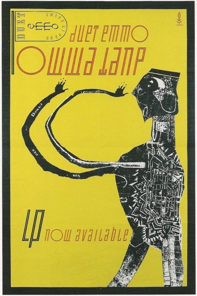
So, Kory et al, what say you? I'm iffy on the typography, yet the whole thing works for me, quite early 20th c. futurist. I'd love a mounted and framed poster of it, in fact.
"Grab some wood, bub.'" - Richard Nixon, Checkers Speech, abandoned early draft
-
Marky Dread

- Messiah of the Milk Bar
- Posts: 58984
- Joined: 17 Jun 2008, 11:26am
Re: Covering Album Covers
That mustard yellow is very GEERish.Dr. Medulla wrote: ↑30 Oct 2017, 4:04pm
So, Kory et al, what say you? I'm iffy on the typography, yet the whole thing works for me, quite early 20th c. futurist. I'd love a mounted and framed poster of it, in fact.
Forces have been looting
My humanity
Curfews have been curbing
The end of liberty
We're the flowers in the dustbin...
No fuchsias for you.
"Without the common people you're nothing"
Nos Sumus Una Familia
-
Dr. Medulla
- Atheistic Epileptic
- Posts: 116606
- Joined: 15 Jun 2008, 2:00pm
- Location: Straight Banana, Idaho
Re: Covering Album Covers
Tho I don't care much for the album, GEER is far and away my favourite Clash sleeve.
"Grab some wood, bub.'" - Richard Nixon, Checkers Speech, abandoned early draft
-
Flex
- Mechano-Man of the Future
- Posts: 35951
- Joined: 15 Jun 2008, 2:50pm
- Location: The Information Superhighway!
Re: Covering Album Covers
My ideas are always extremely the best imhoDr. Medulla wrote: ↑28 Aug 2017, 2:21pmMy inclination, too, would be to get rid of the text—leave it for the back sleeve—but Flex's idea of a fascist aesthetic with the text is kind of intriguing.
Wiggle, wiggle, wiggle like a bowl of soup
Wiggle, wiggle, wiggle like a rolling hoop
Wiggle, wiggle, wiggle like a ton of lead
Wiggle - you can raise the dead
Pex Lives!
Wiggle, wiggle, wiggle like a rolling hoop
Wiggle, wiggle, wiggle like a ton of lead
Wiggle - you can raise the dead
Pex Lives!
Re: Covering Album Covers
Dr. Medulla wrote: ↑30 Oct 2017, 4:04pm
So, Kory et al, what say you? I'm iffy on the typography, yet the whole thing works for me, quite early 20th c. futurist. I'd love a mounted and framed poster of it, in fact.
I like it. My only suggestion would be to have the figure invade the text space a bit to make them interact more.
The O in that typeface is kind of funny—I'd assume the type designers were either trying to make sure the O didn't cause confusion with a capital D (though the face looks to be all lowercase. I'd be interested in the uppercase version—the O may be from that), or just trying to be quirky. It makes it more difficult to read, but the poster demands attention, so you wouldn't be skimming it anyway.
"Suck our Earth dick, Martians!" —Doc
-
Dr. Medulla
- Atheistic Epileptic
- Posts: 116606
- Joined: 15 Jun 2008, 2:00pm
- Location: Straight Banana, Idaho
Re: Covering Album Covers
Flex in 2001 wrote:They should do a Star Trek prequel series about the first Enterprise and get Scott Bakula to be the captain.
"Grab some wood, bub.'" - Richard Nixon, Checkers Speech, abandoned early draft
-
Dr. Medulla
- Atheistic Epileptic
- Posts: 116606
- Joined: 15 Jun 2008, 2:00pm
- Location: Straight Banana, Idaho
Re: Covering Album Covers
What about having the name of the group three times, especially all in the same place? How would you justify that?Kory wrote: ↑30 Oct 2017, 5:06pmI like it. My only suggestion would be to have the figure invade the text space a bit to make them interact more.
The O in that typeface is kind of funny—I'd assume the type designers were either trying to make sure the O didn't cause confusion with a capital D (though the face looks to be all lowercase. I'd be interested in the uppercase version—the O may be from that), or just trying to be quirky. It makes it more difficult to read, but the poster demands attention, so you wouldn't be skimming it anyway.
"Grab some wood, bub.'" - Richard Nixon, Checkers Speech, abandoned early draft
-
Flex
- Mechano-Man of the Future
- Posts: 35951
- Joined: 15 Jun 2008, 2:50pm
- Location: The Information Superhighway!
Re: Covering Album Covers
IT WAS SO PERFECT ON PAPERDr. Medulla wrote: ↑30 Oct 2017, 5:07pmFlex in 2001 wrote:They should do a Star Trek prequel series about the first Enterprise and get Scott Bakula to be the captain.
Wiggle, wiggle, wiggle like a bowl of soup
Wiggle, wiggle, wiggle like a rolling hoop
Wiggle, wiggle, wiggle like a ton of lead
Wiggle - you can raise the dead
Pex Lives!
Wiggle, wiggle, wiggle like a rolling hoop
Wiggle, wiggle, wiggle like a ton of lead
Wiggle - you can raise the dead
Pex Lives!