Re: Terrible Clash Covers
Posted: 13 Feb 2012, 8:40pm
Great ep tho'.Chuck Mangione wrote:Definitely the worst album cover of all time.
Great ep tho'.Chuck Mangione wrote:Definitely the worst album cover of all time.
What's so bad about it?Chuck Mangione wrote:Definitely the worst cover art of all time. Especially of the Clash's whole catalogue.
I think it's a pretty neat concept for a cover that fits nicely with the song.Heston wrote:What's so bad about it?Chuck Mangione wrote:Definitely the worst cover art of all time. Especially of the Clash's whole catalogue.
I think it's a good cover design. It does fit in with the song and both characters are in the RTC video.Marky Dread wrote:I think it's a pretty neat concept for a cover that fits nicely with the song.Heston wrote:What's so bad about it?Chuck Mangione wrote:Definitely the worst cover art of all time. Especially of the Clash's whole catalogue.


In a fairly rare turn of events, my view is precisely the opposite of Maj's.Silent Majority wrote:The Call Up's a lot cooler looking than the dated looking CCR's cover.
CCR works soley on the fact that it has that cheap tacky D.I.Y. look and feel and that the boldness of the handwritten lettering is made all the more effective on it's blue background making it stand out. Very punk in the same way Jamie Reid used the colours Pink and Yellow on the "Bollocks" sleeve.101Walterton wrote:I love that CCR cover, both are great covers.
Definately and thats what I love about it.Marky Dread wrote:CCR works soley on the fact that it has that cheap tacky D.I.Y. look and feel and that the boldness of the handwritten lettering is made all the more effective on it's blue background making it stand out. Very punk in the same way Jamie Reid used the colours Pink and Yellow on the "Bollocks" sleeve.101Walterton wrote:I love that CCR cover, both are great covers.
And you disagree just to be wrong.Flex wrote:In a fairly rare turn of events, my view is precisely the opposite of Maj's.Silent Majority wrote:The Call Up's a lot cooler looking than the dated looking CCR's cover.
Okay, well let me refrain, not of all time but of the band's output. Straight to Hell and SISOSIG had much better art of the CR era on them then RTC.Heston wrote:What's so bad about it?Chuck Mangione wrote:Definitely the worst cover art of all time. Especially of the Clash's whole catalogue.
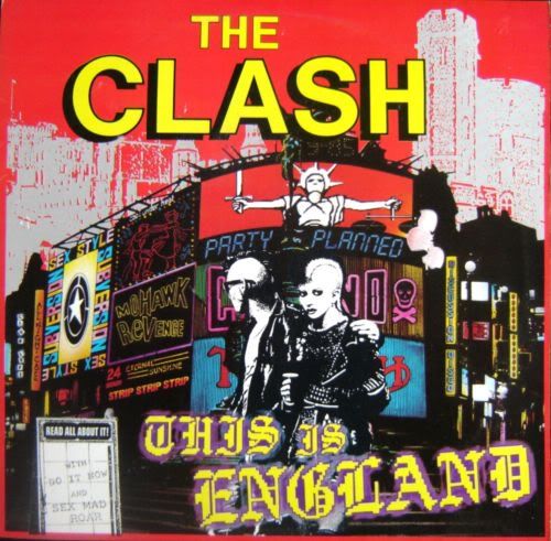
I like it, it's says Clash II to me. Just a shame it's design is to look like Joe on the cover. Punk in the UK in the 80's was all mohawks.Tappy wrote:
Kings Road postcards.Marky Dread wrote:I like it, it's says Clash II to me. Just a shame it's design is to look like Joe on the cover. Punk in the UK in the 80's was all mohawks.Tappy wrote: